UX Case Study: Enhancing Cybersecurity Management with the CMMI Cyber Maturity Platform
In today's digital landscape, cybersecurity is of paramount importance to organizations worldwide. The CMMI Cybermaturity Platform is a cloud-based solution that helps organizations assess, manage, and mitigate cybersecurity risks while improving their overall cyber maturity. This UX case study explores how our team improved the user experience of this platform to enable more effective cybersecurity management and communication with stakeholders.
Basically, The primary purpose of the CMMI Cybermaturity Platform is to assist organizations in the following key areas:
Risk Assessment: The platform allows organizations to assess their cybersecurity risks comprehensively. It provides a framework for identifying vulnerabilities and security gaps within their IT systems and processes.
Risk Management: Organizations can use the platform to create a risk-based plan of action. This plan helps prioritize projects and initiatives aimed at closing cybersecurity gaps and reducing overall risk.
Cyber Maturity Improvement: The platform supports organizations in assessing, optimizing, and reporting on their cyber capabilities. It helps them enhance their cybersecurity maturity and align with globally-accepted industry standards.
Stakeholder Communication: An essential purpose of the platform is to facilitate effective communication with stakeholders, including executives and board members. It achieves this by providing evidence-based reports and a roadmap of risk-based priorities.
Customization: The platform offers customization options, allowing users to tailor reports and assessments to their specific organizational needs.As the inaugural in-house UX designer, I found myself navigating uncharted territory. There were no preexisting design files, no design team for collaboration, and not even a well-defined job description. My initial inclination was to begin building a UI kit, but I struggled to explain its significance. While it would undoubtedly streamline my work, I grappled with how it would genuinely benefit the business.
Through extensive research, I shaped a design strategy for our team's endeavors. My initial step involved initiating a constructive dialogue with the product manager, wherein I systematically outlined the array of challenges our project faced. These encompassed various facets, including navigation complexities, intricate design layouts, user-reported pain points, the absence of a coherent design system, and a host of anticipated hurdles. Our overarching objective centered on the creation of a more potent framework to address these navigation-related challenges.
Our research process featured several pivotal components. Firstly, we engaged in a deep dive into User Feedback, amassing valuable insights from user perspectives that cast light on pain points and areas ripe for improvement. Concurrently, we conducted a meticulous Load Time Analysis, a revelation of our high bounce rates attributed to sluggish website loading speeds. Complementary to this, we undertook A/B Testing to experiment with diverse design elements and features, aiming to pinpoint enhancements with the most significant positive impact. Our examination of Content Performance played a vital role, helping us identify avenues to enhance user engagement and interaction.
ISACA’S CMMI PLATFORM
Simultaneously, we scrutinized User Behavior Patterns, a discerning insight that unveiled a concerning trend of significant user abandonment. With these actionable insights in tow, we gained a more profound understanding of user needs and preferences, along with a heightened awareness of the technical challenges at hand. Armed with this knowledge, we established concrete and achievable objectives and conceived a holistic design strategy focused on optimizing user-friendliness and efficiency, thereby paving the way for a more refined and potent platform.
Conversations of Customer Pain Points:
Ineffective Header Menu:
Issue: I've noticed that our current header menu can be confusing and lacks efficient organization, making it frustrating for users to find what they need quickly.
Pain Points:
Users may get frustrated and confused while searching for specific content.
We risk losing user engagement as visitors might leave due to navigation difficulties.
Resizing Problems:
Issue: Our website's pages don't resize well on different devices and screen sizes, leading to a poor user experience, especially on mobile devices.
Pain Points:
I've observed frustration among mobile users who struggle with reading or interacting with content.
We might be losing mobile traffic, which affects accessibility.
Footer Problems:
Issue: Our website's footer may contain broken links, outdated information, or design inconsistencies.
Pain Points:
If users encounter issues in the footer – a prominent website section – they may perceive our organization as unprofessional.
This can have a negative impact on trust and credibility.
Solutions:
Revamped Header Menu:
I propose implementing a user-friendly, well-organized header menu that logically categorizes content.
Clear labels and intuitive icons can guide users efficiently.
Dropdown menus for subcategories can reduce clutter and improve accessibility.
Responsive Design:
We should develop a responsive web design that seamlessly adapts to various screen sizes, ensuring optimal user experiences on both desktop and mobile devices.
Rigorous testing and optimization for different browsers and devices can eliminate resizing issues.
Footer Optimization:
It's crucial to review and update the footer section to eliminate broken links and outdated content.
We must ensure a consistent design and include essential information such as contact details and navigation links.
Regular checks and updates will maintain footer integrity.
Change of Plans:
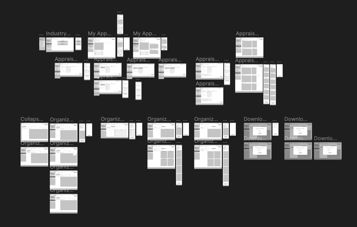
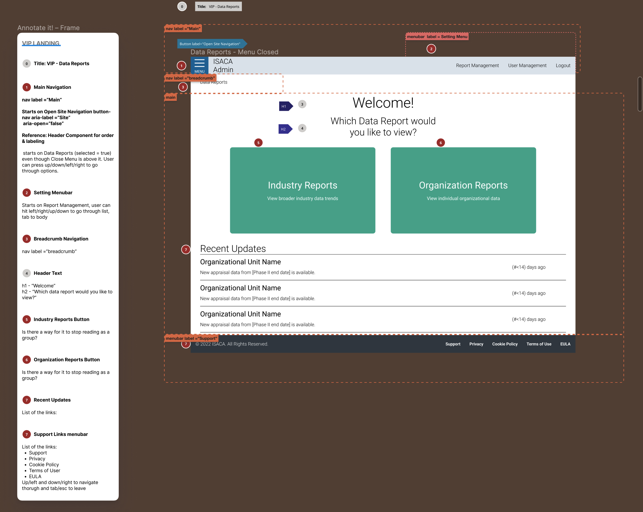
Upon accessing the CMMI Platform, it becomes apparent that our initial priority is the development of a homepage. This journey commenced with a focus on three key elements: Data Reports, Resource Page, and the creation of a User Portal. The User Portal aimed to provide a more streamlined access point for users to explore a wide array of educational materials, including whitepapers, webinars, ebooks, toolkits and templates, research reports, blogs, and articles. The process kicked off with the creation of a low-fidelity menu wireframe.
Homepage Data Report and Resource Page
Prototype
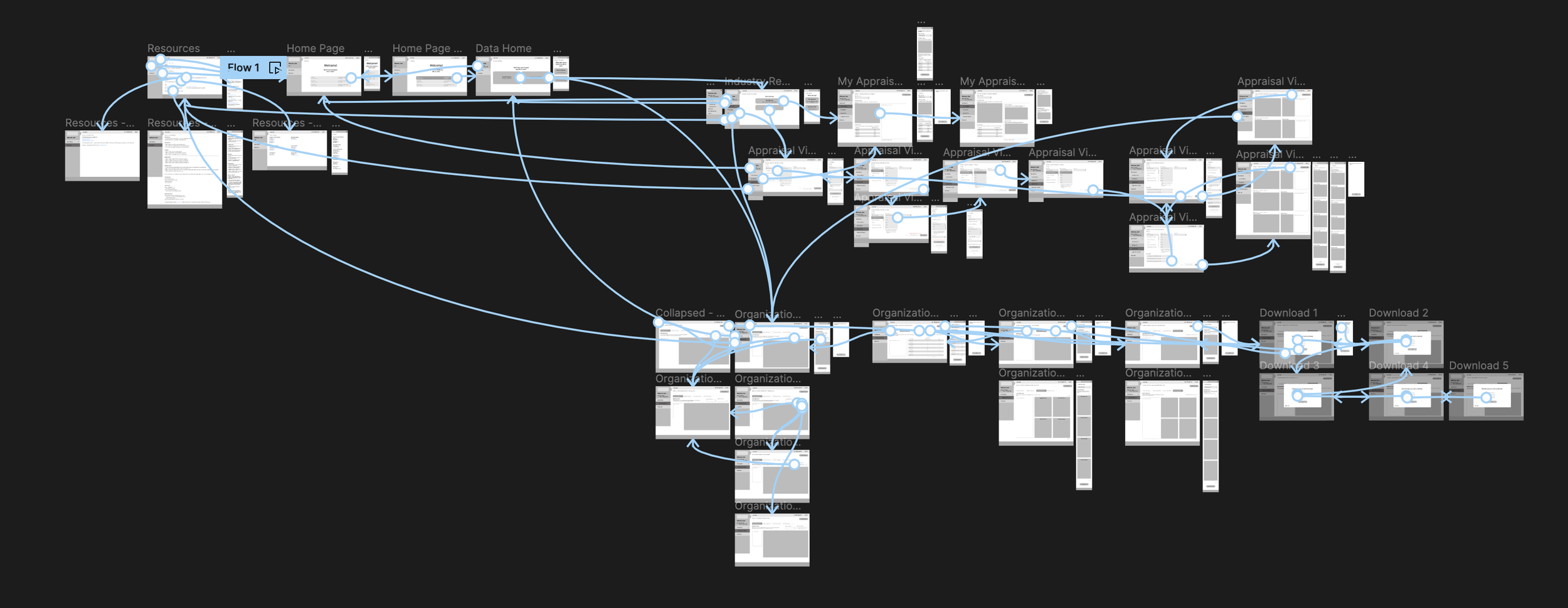
User flow..
Documentation:
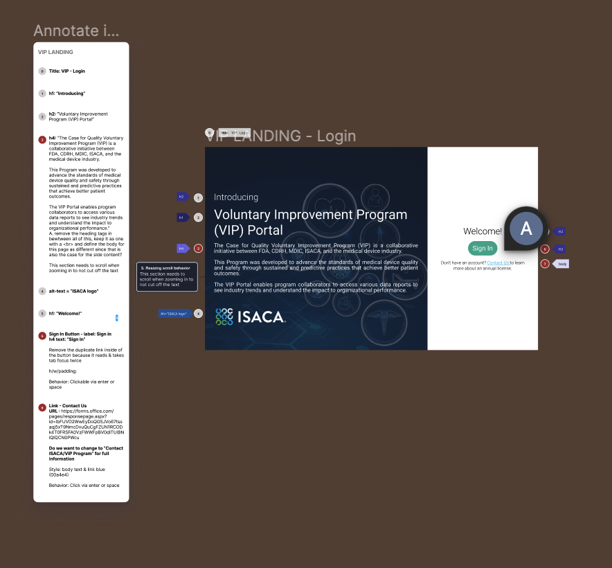
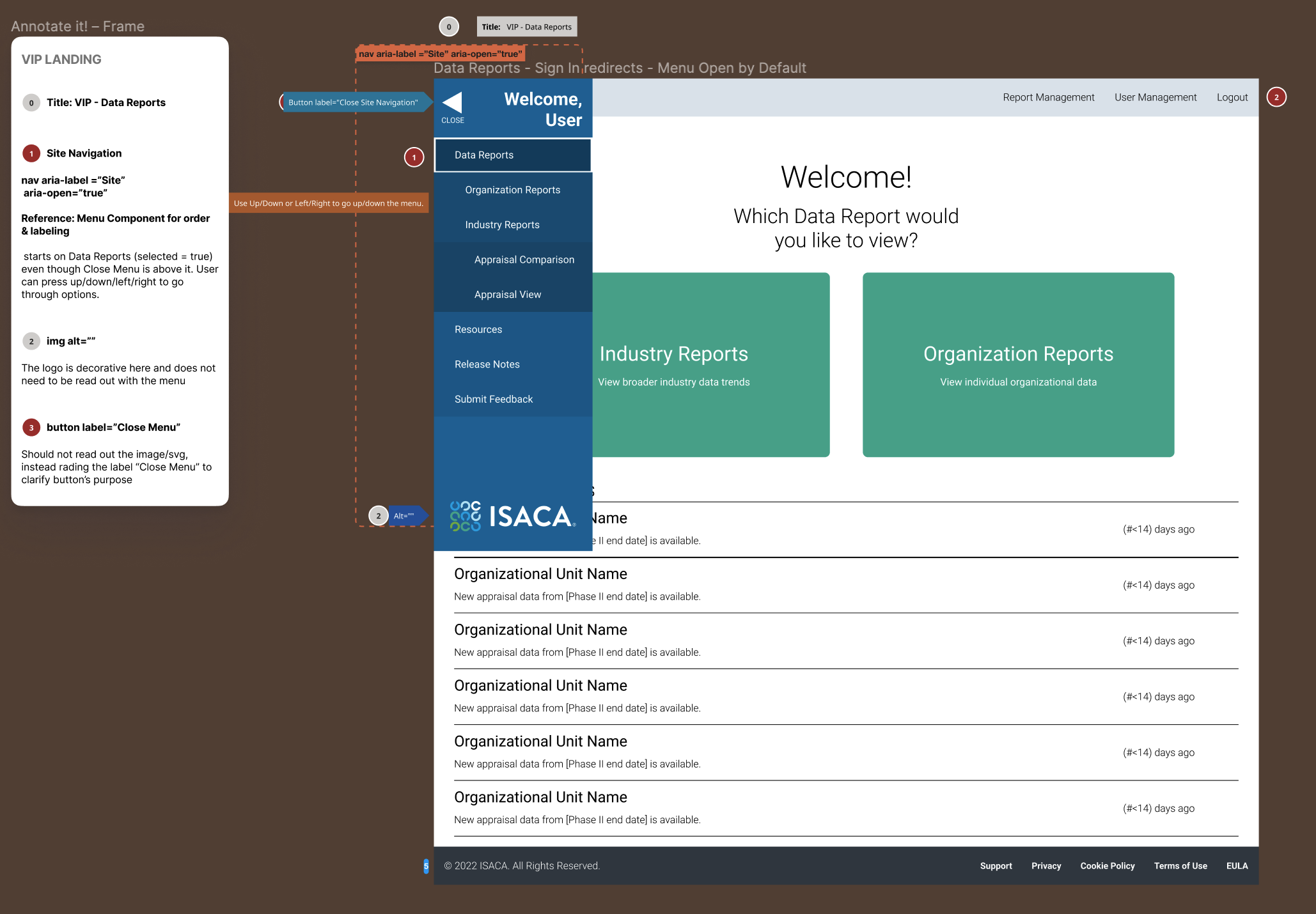
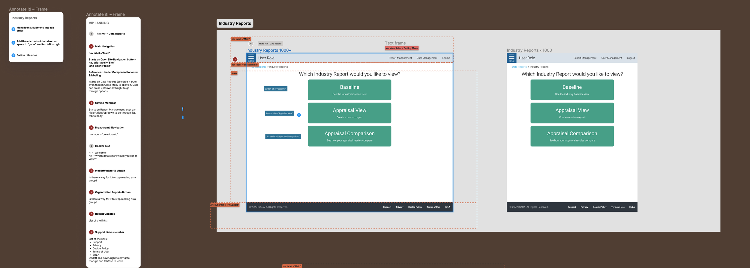
During the process of designing the Isaca webpage, ensuring that everyone involved in the design decisions could understand and contribute effectively was a top priority. Documenting our progress became a crucial aspect of this endeavor, and annotations played a pivotal role in achieving this goal. Annotations not only provided clarity and improved understanding but also significantly facilitated collaboration among team members. Moreover, they served as valuable tools for training and knowledge sharing within the team, enhancing our collective expertise.
Leveraging Figma components for designing headers and navigation, in collaboration with the product manager and developers, has greatly enriched our ideation process. Collaborating within Figma allowed us to gather insights from cross-functional team members, fostering a deeper understanding of user needs and technical considerations. This collaborative approach not only enhanced the quality of our design ideas but also ensured that they align closely with the overarching goals of the ISACA ecosystem.
Furthermore, utilizing Miro as our collaboration tool offered us a holistic platform to maintain consistency across the ISACA ecosystem. By centralizing our design discussions, feedback, and revisions in Miro, we could collectively visualize and refine our ideas. This not only improved the coherence of our design elements but also facilitated the documentation and organization of the ISACA design system. This systematic approach ensures that our design decisions are well-documented, accessible, and adaptable, ultimately contributing to a more cohesive and user-centric ISACA ecosystem.
Crafting User-Centric UI Elements: Menu Navigation, Button Styles, Lists, and Breadcrumbs
Inspiration:
I found inspiration and guidance in the complex and well-documented design systems of companies like IBM, Airbnb, Google, Apple, and Atlassian.


IBM Design Language


Challenges along the way:
As I delved into the design system project, I encountered significant challenges that slowed down my design process, causing it to be both laborious and unproductive. Despite being a member of an Agile team, I found myself struggling to maintain agility. Initially, proposing the creation of a design system was met with resistance and skepticism, but over time, we managed to secure the support necessary to move forward.
Here are the advantages of establishing Isaca’s design system:
Significant time savings.
Ensuring consistent UI (which boosts brand trust).
Reducing complexity and eliminating ambiguity.
Facilitating collaboration and consensus-building.
Establishing a solid foundation for ongoing improvements.
In essence, we contended that crafting a design system would enhance our speed, quality, and overall effectiveness.
Inventory:
Among the various phases, cataloging UI elements proved to be the most laborious and time-intensive, second only to the editing process. Some of the challenges I encountered included:
Organizing elements effectively.
Establishing consistent naming conventions.
Capturing various states comprehensively.
Maintaining progress tracking.
Crafting dynamic and nested symbols.
Adhering to the principles of Atomic Design.
Sustaining focus and motivation throughout the process.
There was a particular moment of distress when I lost a significant portion of my work (several hours) due to a computer crash, leading to a brief yet profound existential crisis. This experience taught me the importance of committing changes early and frequently, eventually leading us to incorporate version control for our design files using Abstract.
Changing ISACA Header Menu, Resizing Issues, and Footer Problems
Working alongside our VP of Product, I believed that enhancing our ISACA website's header menu, resolving resizing issues, and fixing footer problems would make a significant difference in our users' experience. I was convinced that these changes would not only increase user engagement but also attract new members and retain existing ones. The improvements we proposed aimed to streamline navigation, ensure responsiveness across devices, and maintain a cohesive and professional website design.
After addressing the ISACA Header Menu, Resizing Issues, and Footer Problems, I directed my attention towards optimizing button design within ISACA's design system. My primary concerns revolved around inconsistent button styles, which led to user confusion, accessibility challenges, mobile usability issues, and an overwhelming number of intricate button variations. To tackle these challenges, I initiated a process of conducting user research, implementing accessibility audits, optimizing button designs for mobile devices, and simplifying our array of button variations. As a result of these efforts, we successfully achieved a more uniform user experience, bolstered accessibility, improved mobile usability, and streamlined our design and development processes. This case study serves as a compelling reminder of the critical importance of maintaining a robust design system within our organization.
